Cracker Barrel Logo Redesign 2025 Update
By Asmita - Aug 21, 2025
Cracker Barrel has updated its iconic logo to embrace a more modern and minimalist design, sparking discussion among loyal customers and design enthusiasts. The redesign features a cleaner silhouette of the rocking-chair figure and a sleeker version of the barrel, while the typography has been refined for better digital visibility. The move towards modernization aims to appeal to younger audiences and improve branding consistency across platforms, reflecting a broader trend in the industry towards minimalism and versatility. The logo update signifies both risks and opportunities for the brand, as it navigates balancing tradition with contemporary appeal in an evolving marketplace.
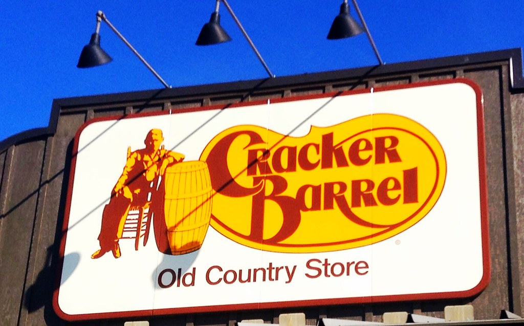
Cracker Barrel via Flickr
Cracker Barrel, the beloved American restaurant and country store chain, has quietly implemented a major update to its iconic logo, sparking immediate discussion among loyal customers and design enthusiasts alike. For decades, the Cracker Barrel logo has been a nostalgic symbol, featuring an old-fashioned gentleman in a rocking chair next to a wooden barrel. This imagery evoked simpler times, traditional values, and the rustic charm that the brand has continuously built its identity around. However, the latest redesign signals a significant step toward modernizing the company’s image while still attempting to maintain ties to its cultural roots. Fans who have spotted the new emblem instantly noticed that the update feels cleaner, brighter, and distinctly contemporary compared to its predecessor.
The most significant alteration is the removal of certain intricate details that once defined the original look. Gone is the highly detailed illustration of the rocking-chair figure, which has been replaced with a simplified silhouette that relies on sharper lines and minimal shading. The barrel remains, but it too has been streamlined into a sleeker version, eliminating ornate wood grain details that once appeared hand-drawn. Typography also received a modern lift, with the traditional serif font being refined into a bolder variant that enhances visibility at smaller sizes and screens—a clear nod to the importance of digital branding in today’s marketplace. This evolution not only makes the logo easier to reproduce across platforms but also reflects a broader industry trend toward minimalism and versatility.
For many longtime customers, the change represents more than just artistic redesign; it marks a cultural and emotional shift for the chain. Cracker Barrel has always positioned itself as a destination that recreates the feel of rural America, serving comfort food in a setting filled with antique décor and down-home hospitality. Altering such an emblematic piece of their identity brings both risks and opportunities. Some guests feel that modernizing the logo strips away part of the heritage and charm that made the chain unique in the first place. Others, however, see the update as a smart move for a brand that must evolve to stay relevant to younger audiences who value clarity and aesthetics optimized for digital use.
Industry analysts point out that this logo refresh mirrors moves made by other heritage brands that have gradually abandoned complex imagery in favor of clean, scalable logos that resonate across both print and digital media. This change also coincides with Cracker Barrel’s growing push into e-commerce and delivery services, where a simplified logo improves legibility on apps and packaging. While reactions remain mixed, there is no denying that this rebranding effort will play a crucial role in shaping how future generations perceive the restaurant and store chain moving forward.
_20250820T135143567Z.jpeg)